Components
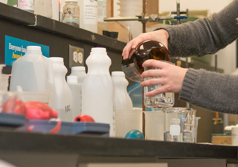
Components act as a sort of plug-in used in order to allow for the consistent use of commonly requested elements. Components are designed to be easy to deploy and maintain. Contact Web Services if you would like to add a component on your page.
An accordion may be useful on pages where the reader is interested in only some of the information, such as an FAQ page. Accordions burden the reader with the responsibility to choose what they want to read next. They are not a solution for organizing long pages.
This element is an example of an accordion.
Web Services is using the Localist platform to publish a calendar of events on the website. That same data is used to populate the app calendar.
Events are sorted by campus groups/organizations and various filters that explain the types of events and audiences invited.
Widgets can be created to make a customizable mix of events on department web pages. For academic departments we recommend the department events in combination with the academic calendar campus closures/no classes events.
SUU employees can be given access to maintain their events inside of Localist. We just ask that everyone pays attention to events that are published in the calendar and avoid posting duplicate events.
A Directory of People can be used to build a contact page, to include a contact person in a page, to build a listing of people on a committee, etc. The contact information for SUU employees is pulled in directly from Banner data and mySUU portal information.
The following information comes from Banner:
- name
- title
- office
- phone
- email address
Changes to this information must be sent to the Human Resources office
The following information comes from mySUU:
- office hours
- website
- biography
Changes to this information must be done by the individual by logging into the mySUU profile.
Headshot comes from a central repository that is on the main SUU web server. These photos are used in the directory search and throughout the SUU website where applicable. Replacement photos can be taken by Photo Services in the Marketing Communications office. If someone already has a professional photo they'd like to use, that can be sent directly to Web Services.
Layout Examples:
Icon cards use FontAwesome icons to add a visual elements to links. Do no rely on the icon to communicate important information. The link text must accurately describe the purpose of the link.
Image cards provide a way to use visuals to link to other content. They can include subheadings as well as more descriptive text.


An image gallery provides a way for users to preview several small images. The full size image will display on the screen when the user selects the corresponding thumbnail image, dimming the rest of the web page.
A modal is a dialog box that displays on top of the current page. It can be used to show further information about a topic without taking up space on the page itself. A modal consists of two parts - the modal, and a link to open the modal.
You can view a modal by visiting the Program Finder and selecting a program link from the main table.